Saturday, September 24, 2022


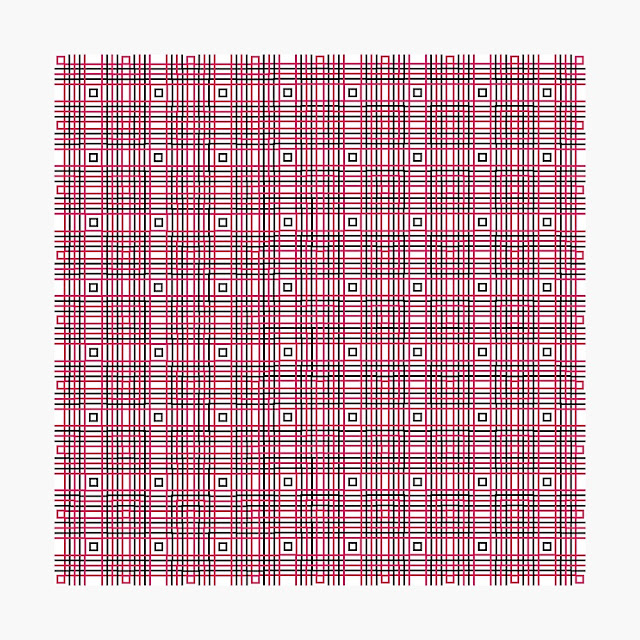
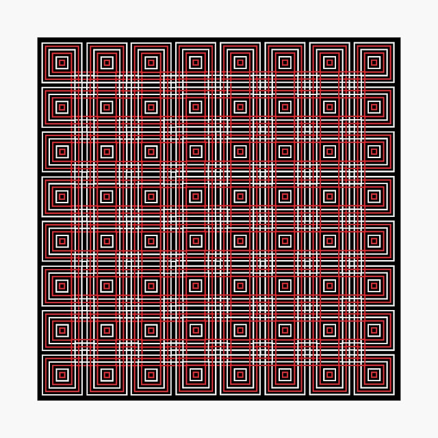
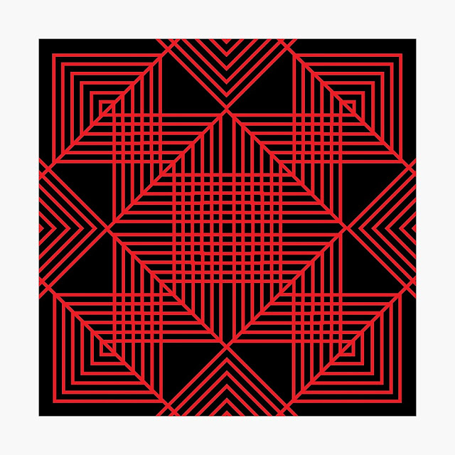
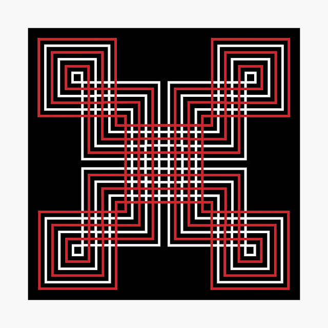
INTERLOCKING SHAPES 

Interlocking Shapes 
100 Designs by Neil Feigeles


The original digital artwork is 45"x45".
All art © Neil Feigeles 2022

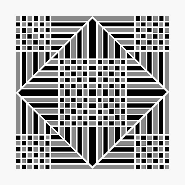
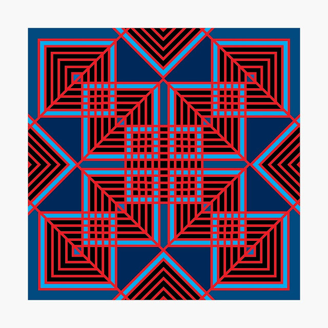
For the design series I call ‘Interlocking Shapes’, I wanted to play with the idea of what happens when shapes intersect, what other variations could I discover & come up with…

Showcased here are 100 of those designs and variations in the series, I think that others might like as much as I do. 

Let me know if you agree. Any questions, please ask away.


BELOW ARE SOME OF THE DESIGNS SHOWCASED IN THE VIDEO


To learn more about me and my art, please check out; https://neilfeigeles.net To learn more about these and my other Designs… please check out : https://neilfeigeles.net/designs/ If you like the art, and would like to perhaps pick up a t-shirt, poster, and so much more with my designs on them, please check them out on Redbubble.com Note: The art is also available online at other Print on Demand sites, but all are currently on Redbubble.com … where you can find over 850 of my designs each showcased on over 75-95 different products… please check them out… https://www.redbubble.com/people/neilfeigeles/shop?artistUserName=neilfeigeles&asc=u&collections=2734472&iaCode=all-departments&sortOrder=recent https://www.redbubble.com/people/neilfeigeles/shop?artistUserName=neilfeigeles&asc=u&collections=2734472&iaCode=all-departments&sortOrder=recent pattern #patterns #design #redbubbleshop #redbubbledesign #redbubbleartist #redbubble #popart #retro #SVA #geometric #alternating #box #boxes #black #red #white #line #interlocking


INTERLOCKING SHAPES  
© Neil Feigeles 2022

Monday, June 14, 2021

GAY PRIDE DESIGNS 
Like many other creative types, during the Summer of 2020, as the world shut down, while we waited for the horror we were surviving through to end and return us to some semblance of normality, I tried to use my time off by coming up with ways to use to be creative. Initially this design spurt began with me simply sketching in pen and ink, trying to simply draw a superhero, and in the background I drew a bit of cross hatching, multiple short black lines going horizontally, next to other multiple lines going vertical, and like a lot of other times when I get an epiphany, when I stepped back, I internally screamed with excitement. Because with that one sketch, I was already conceiving what turned out to be over 100 designs which i spent the next several days creating.  
And as the weather heated up my creativity, shall we say my mind went into over drive, as I pretty much let my imagination run free and I had possibly my most creative artistic stretch since I spent 4 years in college, during my days as a student at the School of Visual Arts. Happily, I can report here, what I came up with honestly surprised and excited  me enough that it made me ponder yet another career move, yet again. 
Pretty much I let myself go, and went from gradations, to shapes, to abstractions, to all sorts of things, amongst the over 350 or so designs I came up with in a matter of months. Some of these designs, I likes so much that not only could I showcase these for my portfolio, I decided to put some of my creations up on my Print on Demand sites, along with my illustrations and digital photography I had already been presenting to the world. During this time, as our nation and the world celebrated Gay Pride, I decided, that I might try my hand at coming up with designs using the colors on the Gay Pride Flag, and spent a good week, simply playing with ideas and designs and came up with some I hoped others might like as well..
Sorry to say, I've been a little absent on this blog, showcasing my designs, and have been meaning to update and showcase some sooner, and finally decided it was time… 
And since it is now, June, Gay Pride Month, I thought what better way to begin showcasing some of these designs I came up with last year here. Here are some of my favorite designs. Hope you like. After each design, there is a link to it's page on Redbubble, where you can see the design on multiple products like T-Shirts, posters, shower curtains, if you're interested. 


Gay Pride - Circle of Love


Gay Pride - Circle of Love
© Neil Feigeles 2020 
I've been thinking of doing a design (or in my case, designs) in tribute to the LGBTQ community. That I could add to my growing Redbubble designs. Using the beautiful colors red, orange, yellow, green, blue, violet, showcased on the Gay Pride Flag. Something hopefully that hasn't been done by everyone else before. After sketching out several ideas, and then having them come to life in first indesign and then photoshop on my computer, I think I might have come up with a few I'm proud to showcase here. Hopefully I've come up a few that people might like, and better yet decide to pick up. All designs in this series, were created in August of 2020

https://www.redbubble.com/shop/ap/54442394?ref=studio-promote


Gay Pride - Circle of Love with Shadows

 
Gay Pride - Circle of Love with Shadows


Gay Pride - Love Squared

Gay Pride - Love Squared


Gay Pride - Rainbow Ring of Pride


Gay Pride - Rainbow Ring of Pride


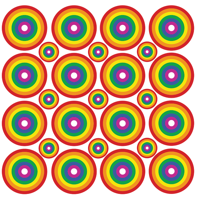
Gay Pride - Circle Rainbow Pattern of Pride

Gay Pride - Circle Rainbow Pattern of Pride


Gay Pride - Circle Rainbow Pattern of Pride Silhouetted

Gay Pride - Circle Rainbow Pattern of Pride Silhouetted

Gay Pride - Rhombus Rainbow Pattern of Pride

Gay Pride - Rhombus Rainbow Pattern of Pride


Gay Pride - Rainbow Rings of Pride

Gay Pride - Rainbow Rings of Pride


Gay Pride - Stripes of Pride Squared

Gay Pride - Stripes of Pride Squared

Gay Pride - LQBTQ Rainbow of Pride

Gay Pride - LQBTQ Rainbow of Pride

© Neil Feigeles 2020

With this design in tribute to the LGBTQ community, I wanted to go back to the source, the stripes of color,  red, orange, yellow, green, blue, and violet, but showcased in a beautiful rainbow, plus I added the letters LQBTQ, which of course represents an acronym for lesbian, gay, bisexual, transgender and queer   in simply graphic stripes of colors.  I also decided to use type for the first time here on Redbubble, and happily I used Gilbert, a sans-serif typeface, which is a tribute font to honor the memory of Gilbert Baker, the creator of the iconic Rainbow Flag. It is also available for free to download on line to use on items which promote the LGBTQ community. All designs in this series, were created in August of 2020

https://www.redbubble.com/shop/ap/54769202?ref=studio-promote


Gay Pride - Rainbow Weave of Pride

Gay Pride - Rainbow Weave of Pride


Gay Pride - Circles and Diamonds Rainbow Pattern of Pride


Gay Pride - Circles and Diamonds Rainbow Pattern of Pride

© Neil Feigeles 2020


Gay Pride - Rainbow With Outline Weave of Pride

Gay Pride -  Rainbow With Outline Weave of Pride

© Neil Feigeles 2020


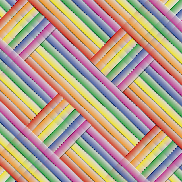
Gay Pride - Rainbow Gradated Cross Weave of Pride


Gay Pride - Rainbow Gradated Cross Weave of Pride

© Neil Feigeles 2020


Gay Pride - Gradated Stripes of Pride


Gay Pride - Gradated Stripes of Pride 

© Neil Feigeles 2020


Gay Pride - Gradated Rainbow Diamond Pattern of Pride

Gay Pride - Gradated Rainbow Diamond Pattern of Pride

© Neil Feigeles 2020


Gay Pride - Even More Gradated Stripes of Pride

Gay Pride - Even More Gradated Stripes of Pride   

© Neil Feigeles 2020


Gay Pride - Gradated Rainbow Square Pattern of Pride

Gay Pride - Gradated Rainbow Square Pattern of Pride  

© Neil Feigeles 2020


Gay Pride - Even More Stripes of Pride

Gay Pride - Even More Stripes of Pride  
© Neil Feigeles 2020


That's it for this time. Any questions please ask… Neil

Monday, October 23, 2017


DESIGNING PROMO FOR NEILIZMS

So you have a site online. How do you get the word out on social media without pushing people away? How to tell friends, family and total strangers out there to drop by and take a few minutes away from their busy lives? With the amount of blogs and sites out there, how do you get people to drop by as opposed to the other places? Well how?  


If you didn't know, I dabble in political commentary, and have since October 2011. Since I launched my blog, I've written 365 commentaries expressing my opinions on the latest event that shook my world. And what had originally been just a way to rant and vent on Facebook has turned into one my major passions. And for whatever I think people might be interested in reading what I think. Happily that thinking, has begun to occur, as my blog and now been viewed by over 56,000 visitors.


Michael Moore in his brilliant Broadway show, The Terms of my Surrender, the possible future Presidential candidate (see the show you'll understand that) tells his audience to get up and do something. The smallest thing could change the world. In a way, Neilizms.com, my political blog is my little bit in trying to make America greater and the world safer for all of us. 


Approximately a year ago, I decided to see how many were visiting my many blogs online. You see I have several, sadly some I actually have forgotten and only remember when I do one of those Google searches on myself. I know, I do it too. I don't know about your reasonings, but in my case its about seeing if anything I'm doing as an actor, writer, graphic designer or illustrator is getting any buzz. 


Or if something I've worked on is in a festival, or if I find out my stuff are in places it shouldn't be. Its quite interesting and sometimes quite infuriating, but its away to see if all my hard work has been worth it. 


Anyway, to my amazement in August 2016, my political site, originally called Neilizms.blogspot.com had suddenly found an audience. I discovered that somehow 10,000 people had dropped by to read my posts. 


Believe me I was shocked, considering the first year of its existence, I was happy if 5 or 10 people had probably accidentally dropped by. But then an amazing thing occurred, I discovered that within a couple months the page views on it went from the 10,000 to 30,000, which was when I realized that I should promote the numbers on social media to possibly help attract a bigger audience. 


So I decided to showcase the visitors to the site by thanking my visitors with a little message on Twitter and Facebook. Which was when I designed the first announcement, which is the first graphic showcased in this post here. Its a shame I hadn't done this from the beginning, I guess a sleep at the wheel. Bad Neil, bad! 


Neilizms is supposedly just a hobby I do in my spare time, I get a thought. Something happens and my mind explodes and thoughts and words just comes spewing out of me. Well it might be considered a hobby by others, but to me its become possibly the way I express myself most. Good or bad I spend way too much time writing articles that probably should be a third shorter.  


But when you got things to say and you run the ship, well, you decide when to say good night. Well how do you get people to drop by? How to announce the latest page visitor tally? Better, is that all I have to pitch is that somehow my site has begun to gain popularity. 


Of course, from researching just a little, my growth in viewers, which I was stunned at is seriously small compared to others. As the numbers grew, I mean, one of my little commentaries has been seen by over 4,000 people. I might not be J. K. Rowling, but averaging over 300 per has to say something. Of course compared to others which average in the millions, my opinions pretty much have been on the down low. 


So once the numbers starting growing I decided my way to pitch it was to do what I used to do when I worked as an art director and graphic designer at Hachette Filipacchi designing onserts, inserts and other magazine promotional elements for their multitude of publications. 


I used to joke, how many ways can you say FREE or 50¢ off? So I began documenting the page views as an exercise in figuring out ways to announce the numbers. As well as trying to showcase a brief history of the site, and of course, most importantly a way to thank those who were nice enough to take the time to read what I had commented on that day.


As you can see from the graphics, each announcement is slightly different. Playing with colors, frames, type faces. I should note, for the most part I've only designed and showcased these designs on Facebook and Twitter. As of now, I haven't been creating direct mail packages or another any kind of ad campaign.  


I should also note, as of now, I honestly still haven't designed a logo for the blog. One would think I would have come up with that even before I first launched the site, when the original url was Neilizms.blogspot.com, I actually was waiting to shorten the site's url, eventually and wanted to wait to see if it would attract any attention.


Sadly backwards thinking. I would say that because of my other pursuits, I've been too busy to spend the time to design logos, but once scanning the items showcased here, it kind of looks like I could have done that too, or done a few less of these. 


That said, here are the designs I have come up with. Its actually been fun playing with the numbers. Kind of takes me back to my life before I transferred to editorial magazine design at the Home Plans Group and before that at ZIff-Davis.


As showcased after I reached 44,000 visitors, I decided to shorten it to 46K on the next announcement. I also started playing with the dimensions of the ads. The frames, and the colors used. Trying to alter each update every time to resign it and best promote the site. 


As the visitors to the blog have continued and the numbers has continued to grow, I thought it was important to make the announcement more substantial. Hence I made it more of a tombstone ad, like the ones I used to help design at Ziff-Davis and their Wall Street Journal and New York Times Forbes campaigns.  As you can see, as I updated this design, its began to get wider. You see I showcase them currently on Twitter, and I've discovered that a tombstone ad can look small when showcased on this Social Media site. I also think it looks better slightly wider, more white space as they say in design speak, well in this case… yellow space.


As well as announcing the good news while trying to get the word out, I also started creating banners to use when announcing the latest entry into the blog.


Along with promoting the growing numbers I also have used my site to try to make statements against what I see as hypocritical problems facing the media. In this case I've stopped watching CNN, as statement against their hiring and firing practices. Here are the first three designs to announce my 'viewer strikes' against the news network. Note, currently its reached 4 months.


The TOP 15 NEILIZMS As I continued writing the editorials, it was interesting to see which ones got the most traction. And once I had written enough I began charting which did the best. Perhaps trying to see what the audience I was acquiring was most interested in reading. Which turned into this design. Here are the first two I came up with.


So there you go. I hope this gives you a good idea of the many ways you can showcase numbers in design. As you can see it can get tedious having to keep coming up with solutions to this design problem, but it as you can see the solutions are never ending.  

Any questions, please ask, and please check out my blog. A direct link to it is:  http://www.neilizms.com 

Neil