HACHETTE FILLIPACCHI MAGAZINES PROMOTIONAL DESIGNS
Trying to make an immediate impact, can sometimes bring you lots of interesting opportunities to really stretch your abilities while giving you a portfolio's worth of samples in a matter of weeks, let alone over the course of two years.
While working at Ziff-Davis, one day, Michelle Flaum, my supervisor there, called me into her office and asked if I was interested in an on-staff gig at Hachette Filipacchi Magazines for their Circulation and Promotion Division. Mind you it wasn't a call I was expecting, but one I had hoped would come again one day.
And for the first time since I was living in Hollywood, working at Twelve Signs Inc., where they published Star Scroll, I could say once more that I was officially an Art Director. Heck, I now had the business card to prove it. I mean how could you turn that down? Honestly I was pretty stoked. Leaving Ziff-Davis, a place I almost considered home was a tough decision. But, since it was a freelance assignment, mind you a full-time freelance position, getting offered a staff job had been something I had been looking for, since, well before I started working at Ziff-Davis over five years before.

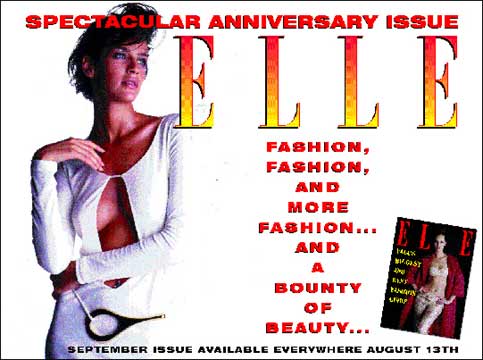
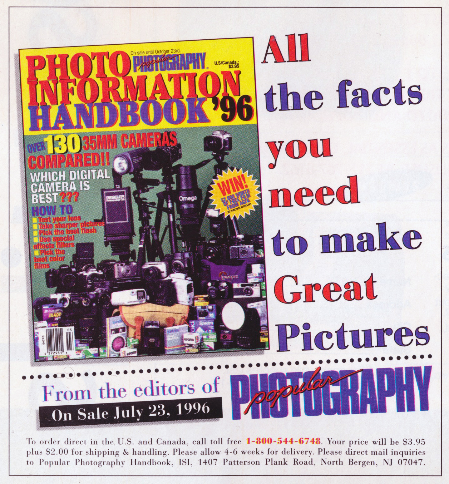
I spent several years at Hachette Filipacchi in their Circulation & Promotional division, working under Harvey Schwartz and Sheri Sanchez, designing promotional material and stationary for more then 30 publications. Including Computer Gaming World, Premiere, Car & Driver, Road & Track, Mirabella, Elle, Elle Decor, Pop Photo, American Photography, Woman's Day, Swing, George and another 20 or so magazines.
What was so much fun about the job was every day I could walk into work and I'd have to whip out a half dozen designs. And one of the best parts about the position was I actually had to deal with all the various art directors and editors of all of the magazines I had to design for.
So one day I would spend working on various Elle and Mirabella designs, the next I would spend working on Popular Photography and Woman's Day. From insert cards to onsets, polybags to subway, bus, & airport posters. From banners to freemiums, Qual forms to stationary, shopping bags to direct mail packages. And I got to see my ideas, go from simple sketches to printed samples sometimes in a matter of days.
In fact there was so much work, that a good 30% of my assignments they actually farmed out to freelancers to work on. The bad part of that, was even though they were supposed to ease my work load, the majority of assignments we got back I had to fix. They actually nicknamed me Dr. Disc., because invariably I would have to spend half a day reworking what the freelancers had given us.
I distinctly remember one designer who sent us files which was supposed to be a two color job. A simply insert card. One PMS of his choice, plus black. The problem being, when I opened the file I discovered 20 different PMS reds. 20! So I had to contact the designer and ask him which color to use.
Like him, sometimes the designers that did this, would simply say, pick one. Really? We're paying you, and you want us to do your job? Not on my watch. Basically my rule was, you want to get paid, fix the file or give me an answer. Otherwise forget your pay. Its amazing how quick a designer comes up with the right color, when given that choice.
One of the highlights during my tenure at Hachette, was helping to launch George magazine. Getting the chance to see the magazine being developed. Helping design promotional material for it, was for me like hitting the mother lode! I must mention that before the magazine was officially titled George, it went through over 20 versions. Each version had different titles, for example, one of them was MARTHA. Get it, as in Martha Washington. So I would redo, the final approved layout, for each different title. Plus they also tested if they should even use John Kennedy's name in the title, since its possible that even might lose sales.

Being the son of Democrats, the Kennedy name was for me, like how the British must look at the Monarchy. So hearing the news that I was gonna meet John, was like 'really' cool. Believe it or not, my earliest memory in life, was sitting in a supermarket shopping cart, while my mom pushed me. Sadly on this day, they announced over the loud speaker that President John F Kennedy had been assassinated. So all these years later, getting the chance to meet him, discover what a great guy he was and seeing him trying to make final decisions on covers and layouts was simply a dream come true for me. Come on, it doesn't get much better then that.

I distinctly remember the week the magazine finally launched and I was eating lunch with a few friends from work, outside in a very crowded area. There must have been a good hundred people or so, sitting there in the sun, when all of a sudden everyone turned their heads at the same time, as John walked by. What got me was, throughout the magazine's development, I had never seen the person that people saw when they looked at him. He was pretty much sans tie, jacket off, his hair disheveled, there was no comb in sight. He walked in his office, sans shoes and really seemed excited about putting out a magazine that said something. Well on this day he was what the people swooned at. He was the sexiest man alive! Wearing what was probably a suit worth thousands and he looked every inch the movie star that people thought he was. And I finally saw what everyone else did. Honestly it was quite eye-opening.

It was so funny, coming into work that afternoon, after lunch and meeting with him, he actually now seemed bigger then life. Took all of three seconds, till our conversation began, when he turned back into the person whom I had grown to know. Sadly, it was while working at Hachette, that I got the chance to witness for the first time the paparazzi that celebrities truly hate. Before the magazine launched, when he got engaged, when he got married and sadly when we learned his fate.

In fact the night of John's accident, I had had a meeting with a vendor, and was returning to the office after 5 PM, to pick up my things. Believe it or not, I ran into John and his wife, and her sister heading out. John was on crutches and we spoke for a minute when he informed me that they were on the way to the airport. That's right, he piloted the plane on crutches! Later that night when the news start reverberating around the world, I just sat there, reliving the last time I ever saw him and his wife. Truly sad. But in my heart, I still believe that somewhere he and his wife are living a life free from celebrity, and simply enjoying their freedom. Thats my story and I'm sticking to it. Much better then the alternative.

The thing that got me the angriest was that the same paparazzi that asked the single ladies if they were upset that John was now marrying someone, were now asking us how we felt about his dying! It was seriously obnoxious. I must tell you that I was not very nice to a few of them that day, I kind of lost it on one or two. Basically could you let us grieve. For you he was a meal ticket, but to us he was simply John.
Didn't mean to get so serious, anyway above and below, you will find a gallery's worth of designs that I did during my tenure as Art Director at Hachette Filipacchi Magazines, Circulation and Promotion division.
As you can see by the samples showcased here, I had lot of opportunities to design for a lot of different types of magazines. Which was a great thing, because honestly trying to come up with a new way of showcasing 50% off, kind of gets boring after the first 100 or so designs.
A funny story, I think, one day I was on the Long Island railroad, going to a friend for the weekend, when this lovely young lady, sat opposite me on the train. She was reading a copy of ELLE Magazine, and every time she got to an insert card, she preceded to rip it out and tear it up. I started to smile, when I realized she was ripping up my work.
Well, at one point as she was about to rip up, one of my better ones, I actually interrupted her, saying something like, "Excuse me, but you know somebody actually spent a lot of time on that card you're about to rip up." She was kind a like, "Huh." I then explained that I was the Designer, I introduced myself to her, revealed my business card, showcasing I was the Art Director, and she actually seemed impressed.
Sadly I didn't get a date out of this, bummer. But, we actually had a nice long conversation after that. I sort of gave her an education in design and I felt I had made her look at promotional materials in a new way. A person actually did that, not a machine. I actually took classes in this. The card didn't print itself. So take a moment to enjoy the beauty in it.
Remember, half the time all you get from the copy person is a sheet of paper with text. Sometimes all they want is text, or you're given photos to work with. And sometimes you set up photo shoots, my personal favorite, but always you have to figure out how to get all of the copy, no matter how much or how little, to actually fit on the allotted area.
The size of the design, the final printed item. Then you have to, well make it pretty, and of course you have to please yourself, your supervisor, the editor of each specific publication, and probably the big fella whose really signing our checks in his CEO office. Lastly, you have to make sure that your design can actually go to press without a hitch.
Another fun thing about working at HFM was, as in the case of SWING, every so ofter they would pick up other company's magazines. So one day, I'd get a call to report to somebodies office and be informed guess what, you got a new publication to add to your 30 others. Personally I loved this. New fonts, new ideas, new editors to work with.
One of the coolest thing about working there, was with most of my designs, from start to finish, I could actually have a printed sample in my hands within days, sometimes even the next day. I remember after I worked there for less then a month, I actually pulled my portfolio out and spent the weekend deciding which pieces stayed and which designs were added. Believe me this isn't such a simple thing when you're removing designs that you yourself had vested so much of yourself into.
And of course, getting the chance to hang at the printers, watching the huge Heidelberg presses churn out my designs right in front of me. The smell, the noise, man I loved it. Simply something all designers should get a chance to do.
No matter the dimensions of the design, your job is to figure out how to make it work. Using, the specs given from the editors on each particular publication or either Harvey or Sherry. Be it, 4C, with or without a fifth PMS, or simply black. A 2 color job, with black & 1 PMS. Varnish or none, Die cut or whatever. And in a lot of instances the design had to be adaptable in many versions, from full page ad, to insert card, to a very thin 1/8 column, which always made for a fun couple of hours of work. In other words, art direction.
Every so often I would be given an assignment to help launch something new, like I had done previously with George Magazine. What's so much fun about working on launches, you get to be the one that might help someone decide to buy that publication. In the case of Classic Automobile Register, I actually don't know what happened to it, but at least I got a few really pretty samples to showcase in my portfolio, and of course here.


One of the cool things about the gig, was in many of my assignments I would design a card for one title, and then discover that I had to create a new version of it, for all of the other titles we published, so like the STOP! card showcased below, I saved the final printed card as a template. And then redid it replacing any art, in this case the magazine cover and text when needed. Sometimes the 'redo' was more complicated. So when designing the initial layout, I always had to keep in mind, that the item probably would become a template for the other titles we published.
The fun thing about designing, is sometimes the design just comes to you. Like this EATING WELL insert, I looked at the cover and I thought, picnic. All I had was the head line copy, and of course, the subscription copy to work with... I mean what can you come up with, when they don't want to spend any money on a photo shoot? So I began to play with a checkered effect and within minutes I had come up with my design.
Looking back now, I have to say that my two years working in Promotion and Circulation, at HFM were some of my happiest days ever. Great people, I learned a ton and I got the chance to design and art direct to my heart's desire.
But as these things happen, while working there, I had been craving a change, honestly I wanted to work in editorial. The real truth, I wanted to see my name printed in the masthead of a magazine.
The only thing I found frustrating about designing promotional material for HFM, or well for anyone was, you never got credit for doing it. I guess my quest for fame and fortune got to me. So after two really fun years, I heard through the grapevine that they were looking for an editorial art director at The Home Plans Group. And well, thats another blog entry… coming soon.
To learn more about my history in design, please check out:
http://neilfeigeles.net/DESIGN.html
Any questions, please ask.
Neil


